If there is one thing that I really enjoy, it’s exploring data spatially. I really enjoy being able to look at a map and see where clusters are and see if I can find trends or even if there is anything near me. To me, this has been one of the main things that I’ve felt that the ADS is missing on its website. There is such a wealth of spatial information in our database that it only makes sense that we should have a really good map, right?
Right?
Well, eventually we will, as soon as I build it.
So what is the plan? I, Teagan, digital archives officer and map enthusiast, will be working towards making a searchable map interface that will work for the ADS Library and maybe more someday, but baby steps. This post will work as kind of a dev library to let everyone know what we’ve (I’ve) been doing towards making this map a reality.
November Update
We chose Leaflet as the software as its both open access and has an existing large community. It’s that community that has allowed us to build what we have so far.
The first step was to determine how the data from our Library would be pulled and displayed on Leaflet. For this we had two options, pull directly from the database or use a csv. Traditionally we pull things directly from our database but the CSV option has a lot of potential for some of our smaller archives. There was also the size to consider; we currently have over 60k spatial points within our database.
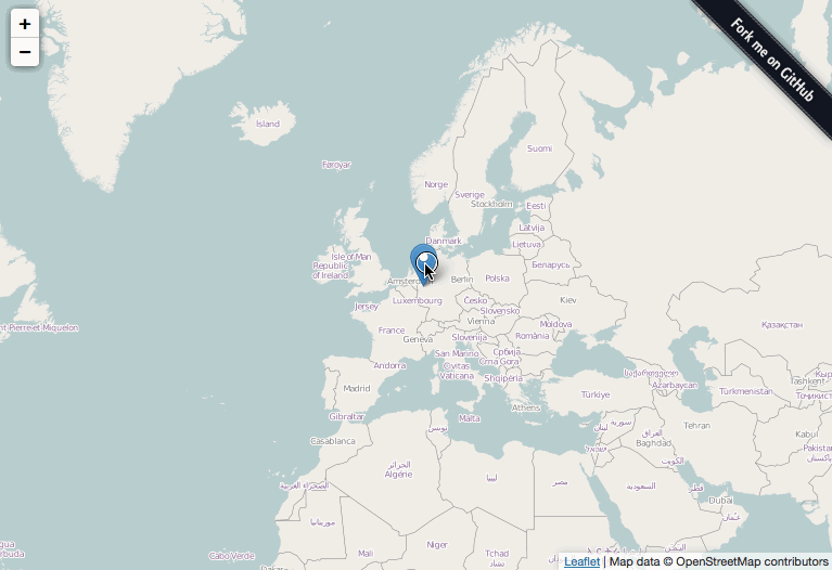
Leaflet Map CSV
In the end, we knew how to pull data directly from the database so we decided to try the csv to compare. Below is an example from github that shows what the plugin displays. In short, it pulls data from a csv and requires Lat, Long, and a “Title” field that can be used in a bind-popup as shown. There can be more columns which you can combine in the popup and its usage of PapaParse allows for a large number of points to be displayed.

Next issue was how do we show more information about each point?
Leaflet Sidebar
We thought that the best way to do this was through the use of a sidebar that could be dynamically filled with other information from the CSV.
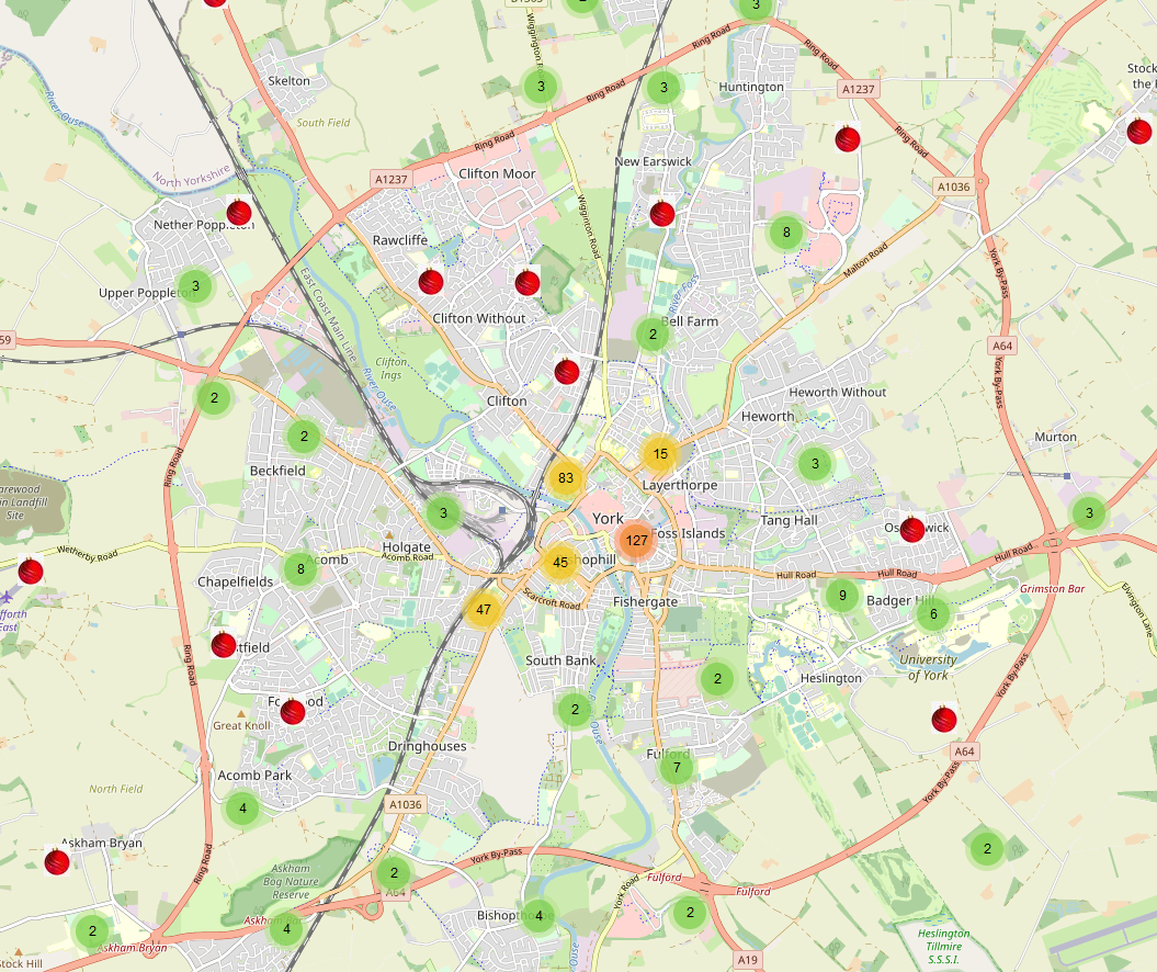
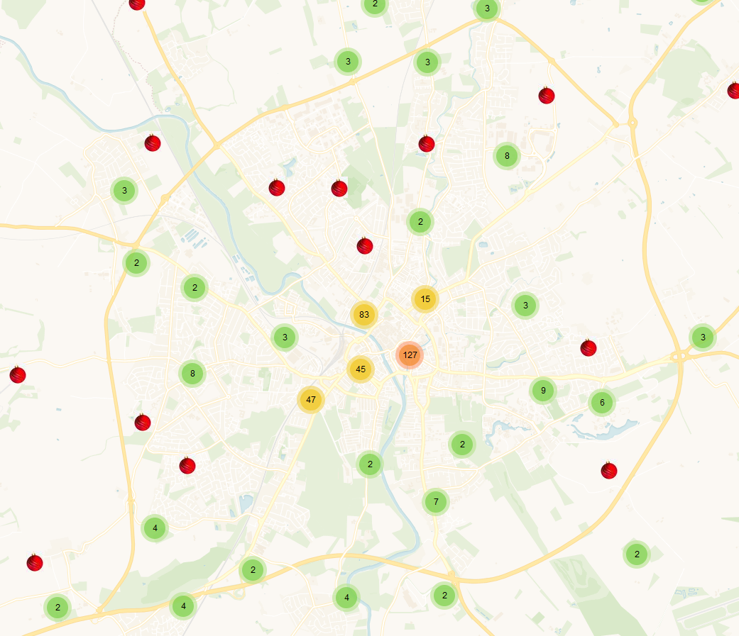
This one was perhaps the trickiest for me. Getting the sidebar to be dynamic as well as the CSS lead to many discussions with the code but we worked it out in the end. There are still some CSS issues to work through but we were quite happy with the way it’s going so far. But 60k points displaying on a full screen map was… messy.
Leaflet markercluster
So we decided to go with clustering, it allowed for grouping of points, multiple points in one location, and it hands a large amount of points well. Plus it’s its really easy to use and implement.

The downside to clustering is I’m not a fan of not being able to show multiple types of clustering but the grouping markers and custom markers might work with that. I need to do more work to add the realworld 50,000 plugin into it as well.
What’s next?
We’re entering a busy bit of time but there are a few things I’d like to explore.
- Investigate what else I can do with markercluster
- Add in basemaps!
- See if a search function is possible using csv. Preliminary searches say yes using geoJason but I need to test it.
- Heatmap? May help cut any lag time and would work better for large areas, like the world view. Go from a heat map then switch to cluster depending on the view.
- Customise the markers a bit more
- Test how this would work on the website and sort out the css…
- Binning regions?
Sneakpeak?
December Update
The data
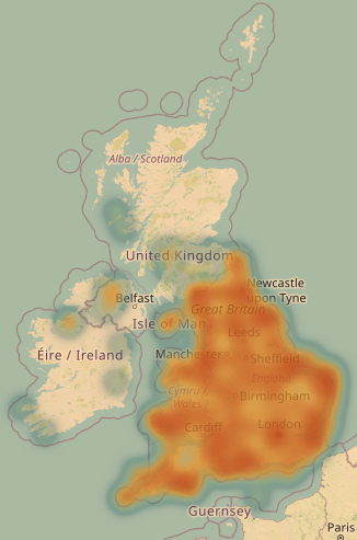
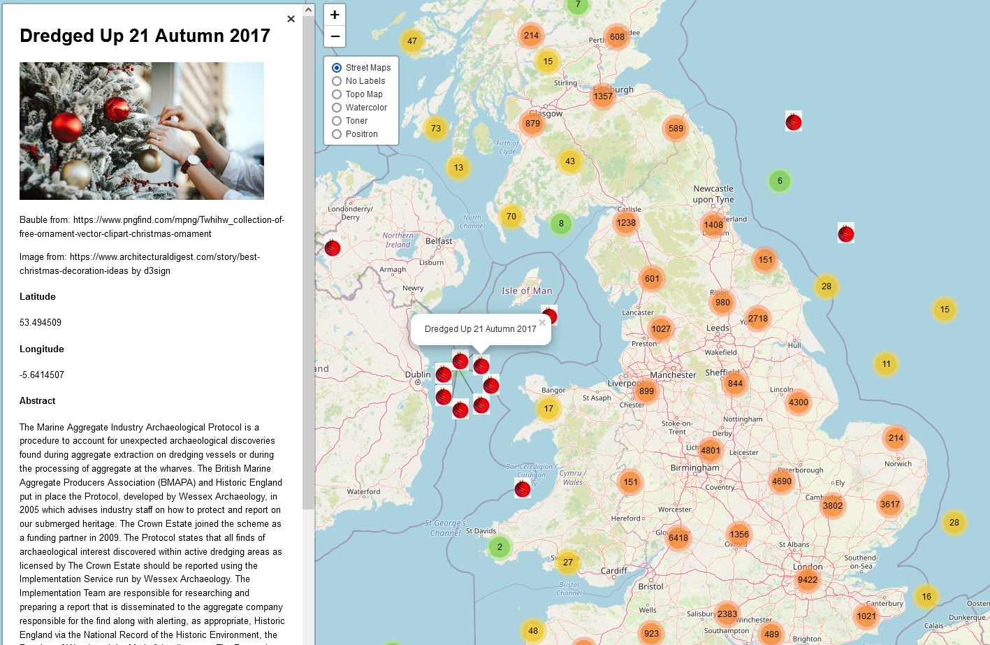
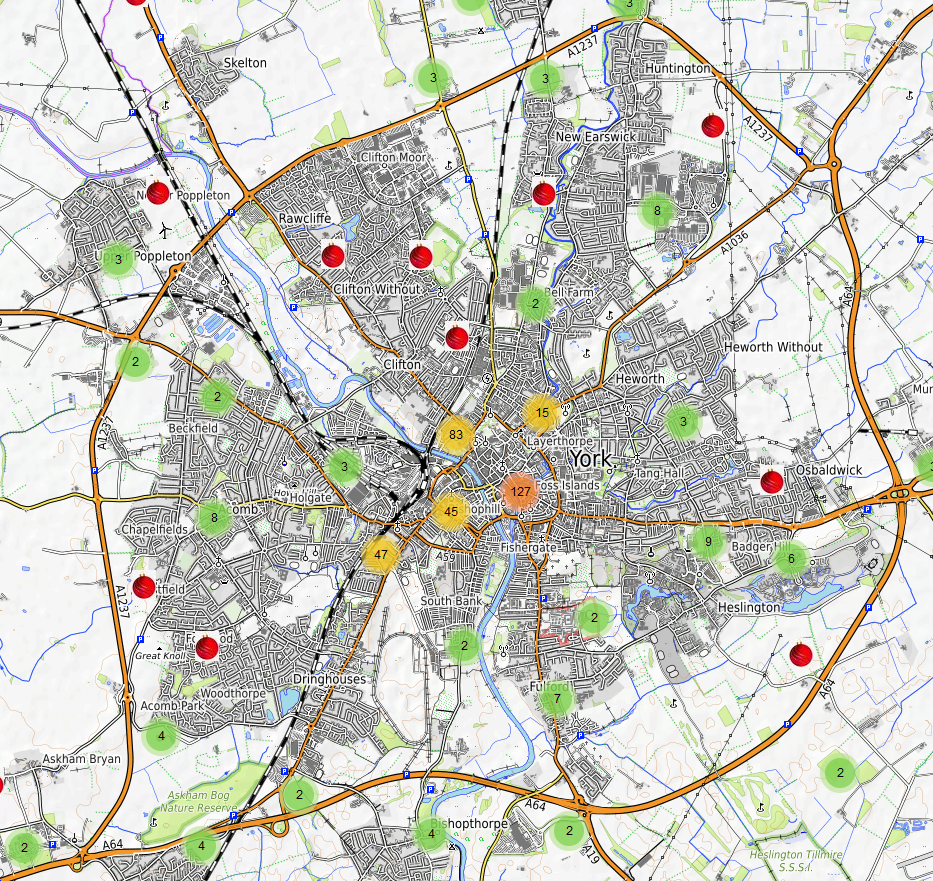
Points, lots of points. This month I tested loading all 63,000+ points into leaflet and it worked far better then I would have initially expected. Marker clustering was able to handle a large amount of points well and I’m interested to see how much more it can hold.
The sidebar in the image above shows the current details from each record: title, Lat/Long, and abstract. Later I’ll see about adding in more details such as links to the record, citations, key terms, authors, etc. At present, there is a stock Christmas image by d3sign there to bring a bit of Christmas cheer but in the future we’ll also need to decide if we add images, logos, etc, and investigate what will be static (appear exactly the same for each point) or dynamically updated (changes for each point, e.g., title)
Custom Markers
Another thing I implemented was the use of custom markers. I’m not sure if the final version will have custom markers but I may use some for grey literature vs journal articles or reference vs full record. A lot of it will depend on what fits best within the map when it’s released and what feedback we hear about how users want to use the map.
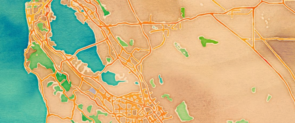
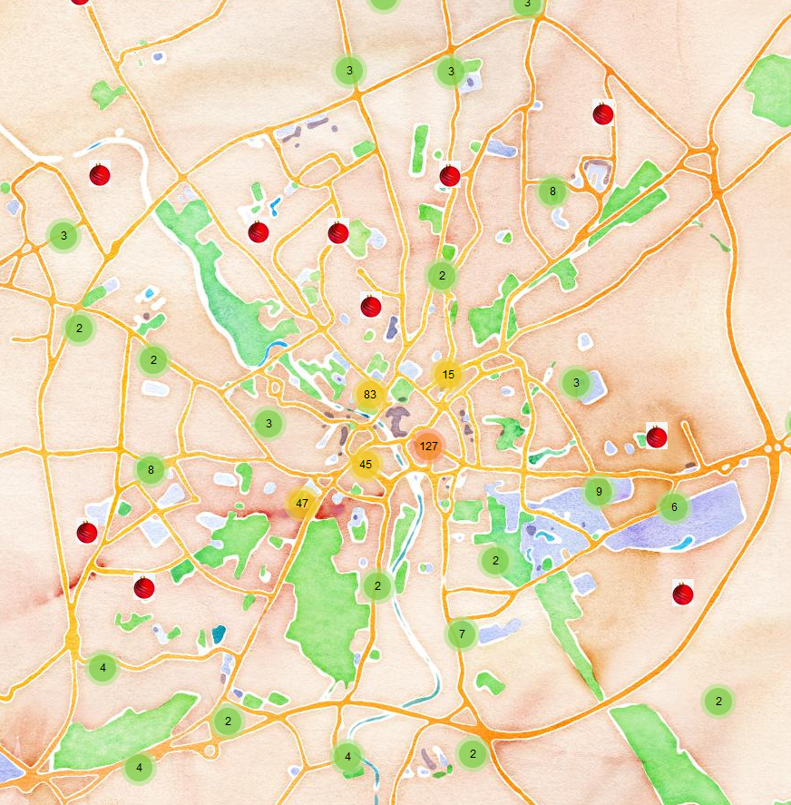
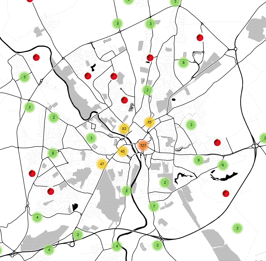
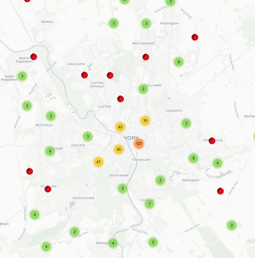
Basemaps
Something that I particularly enjoyed was selecting a few basemaps. It’s yet to be finalised about what maps will be chosen to allow users to change the map backgrounds but my favourites include:
Voyager without labels by CARTO
Failures?
There were a few things that I worked on that I couldn’t get it work with the map in its current form.
Leaflet.Spin
I really like the look of this spinning circle to let you know the screen is taking longer then a millisecond to load. I thought it would be better then the bar that comes with the clustering plugin because the loading time isn’t currently long (think a few seconds, max). That said, I’ll have to look into this more because while I had it appear on the map, it never went away, even after the map fully loaded. I’m so close to make it work but it’ll take more time.
Heatmap
Couldn’t get this one to work. The way that the map currently pulls the data is from a csv. The clustering works fine with looking for the column with the correct label headings but heatmap requires there to not be a header. So similiar methods but different implementations. As such, we still want to use heatmap but we’re going to be pulling the data directly from the database rather then loading from a csv.
The knowledge we learned with working with the CSV will be great in the future though as we have a greater potential to allow for our archive pages and Internet Archaeology to incorporate more maps, more easily.
What’s next?
The holidays. I’m going to be taking an extended one so there is unlikely to be a January update but over the new bit I want to looking to:
- Fixing the loading circle
- Using geoJason as a search/refinement tool
- Adding the Heatmap
- Figure out what an ADS css for the map would be
- Binning regions?
July Update
Time has flown by. With all the work on some major updates to our website, the map has had to take a slight pause.
What’s happened?
In terms of progress, not as much as I would have liked. The loading circle refused to cooperate and while the csv continued to work, there was an issue with how often we’d have to update things. The heatmap worked but there were difficulties in fixing the zoom level so it would transition from heatmap to clustering. At least the css is making progress…
What’s next?
We’re headed up to the ADS’s busy time so not much progress will take place in terms of what will be seen by the public. But in the meantime, might I recommend the ARIADNE Portal?