Accessibility… Who is it good for? … Absolutely everyone.
That’s right. Everyone. Everyone can benefit from improved accessibility in the digital content we all produce. But what steps can we actually take to improve accessibility? In this blog, we will explore a few key actions and tips that can make the digital content you create more accessible.
However, before delving into how we can make accessible content, it is best we explore why accessibility is important. While improved accessibility benefits everyone, there are many individuals within archaeology, and the wider public, who can more readily engage with digital content when steps are taken to improve accessibility. Within this group of people, there are some individuals who would otherwise not be able to engage with digital content without accessibility features being implemented.
According to the 2020 ‘Profiling the Profession’ survey, just over 1 in 10 professional archaeologists self-reported as disabled. The disabilities reported included, but were not limited to: physical (including visual impairment); emotional; information processing; Autism; and progressive conditions. Now, not all individuals who identify as disabled will rely on accessibility features in order to engage with digital content.
However, if we are to champion archaeology being for all, we should endeavour to make the digital content we produce as accessible as possible, breaking down barriers so that all communities and stakeholders are able to engage with our work.
The Principles of Accessibility
To help improve accessibility in the digital content you create, it is best we touch upon the key principles of digital accessibility. Digital content should be:
- Perceivable
- Digital content should be presented in a way that it is perceivable to all users, irrespective of if they have visual, auditory, or cognitive disabilities.
- Operable
- Digital content should be able to be navigable via multiple different controller inputs, i.e. keyboard and mouse or assistive technologies like screen readers.
- Understandable
- Language should be clear and concise. Language should also be easy to understand for all users, and where possible, free of jargon.
- Robust
- Where appropriate, content should be usable on a wide range of devices, being compatible with assistive technologies by being machine readable.
Not all of the above principles are applicable to creating documents, but it is always good to keep the above in mind as we explore the ways in which we can make documents accessible. But what are the ways that we can achieve this?
Font Choice
Font choice ー the realm of many a procrastinator ー can be one of the easiest steps you can take towards making digital content more accessible.
Not all fonts are created equal. The type of font you choose can greatly affect the accessibility of any text-based content you create. This is because some fonts are harder to read than others.
Fonts are typically classified into two separate families: serif and sans-serif fonts:
Serif fonts typefaces with decorative strokes at the end of the ‘main component’ strokes of a letter, can be difficult to read. The text you are presently reading is a serif-based font.
Whereas, sans-serif font typefaces lack the decorative ‘flicks’ that can make a font difficult to process. This blog uses a sans-serif font.
Opting to choose a sans-serif font; typefaces without decorative strokes, can help improve the legibility of text for all users, helping the perceivability of your content. As a first initial step, if you haven’t already, why not consider adopting a sans-serif font for digital content creation and communications including email? This change would benefit all users across an organisation and the wider public. So, next time you are creating a document, consider selecting a common sans-serif font, like Calibri or Arial, as a great first step to improving the accessibility of your digital content.
Document Structure and Styles
We all consider how we structure documents when we create content, breaking the text we write into digestible chunks. We do this in the aim of helping the reader. By creating structure, we help make our digital content more perceivable. Through the use of an inbuilt tool in commonly used word-processors, adding structure to documents can also increase a document’s operability by improving navigability.
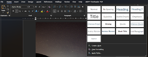
This tool is the inbuilt Styles function. You can typically find this function under the ‘Home’ tab in your word-processing program of choice (Figure 1). Styles are pre-set formatted defaults for the different text levels you use when making a document. Titles, sub-titles, headings, and main body text are all examples of style text levels. At a superficial level, styles help you control the formatting of your document. You can tailor style formatting to fit either your personal formatting preference or company policy, and they act as a quick way to format documents with uniformity. A key feature of styles is their cascading function. If you decide you need to change the font you have used, styles allow you to make a change and apply it through a document with a few clicks of the mouse. Using styles saves you time, ensures uniformity, and removes the tedium of formatting.
But, styles do so much more “behind the scenes”. By assigning a style to text, you also provide contextual information to the word-processor about its hierarchy within a document. The hierarchical structuring through styles does several things to improve your content’s accessibility. Firstly, by assigning where text are headers, main body text, or the title in your document, an outline of the document is automatically created. This outline makes it easy to navigate across the document, allowing easy skim reading, and quick navigation across even large documents. Secondly, the hierarchical information can feed into screen readers, allowing the text to be read aloud as intended, separating audio readouts of headers and main body text. Thirdly, tied to the ease of formatting when creating the document, styles also allow end users to customise text to a form that is most legible to their requirements, if provided in an editable file format.
Meaningful hyperlinks
Hyperlinks often feature in digital documents. When we read a raw hyperlink, we translate the jumble of words in a URL into something meaningful. Screen readers cannot do this. Raw URLs are regurgitated as incomprehensible sounds when using screen readers. We can use hyperlinks to turn URLs into human readable text. Meaningful hyperlinks make your links understandable. They provide context to a link, and should accurately describe the linked location to the reader. Avoid falling into the trap of directive hyperlinks, like “Click Here” or “Click this Link”. Using these phrases provides no context to the content you are linking, and sounds jarring when used with screenreaders.
Rather than copy and pasting a URL, adding context to a hyperlink helps people using screen-readers navigate a document. Here’s an example:
If you want to know more about creating accessible, meaningful hyperlinks, Web Content Accessibility Guidelines (WCAG) has provided a meaningful hyperlinks guide.
One last note regarding hyperlinks: when formatting your document avoid highlighting words by underlining. Underlining words can very easily confuse the reader, as general convention is for hyperlinks to be underlined. If you want to highlight words, it is best to use bolding to do so.
Alt Text for Images
An image on its own is inaccessible to visually impaired users. Steps need to be taken to make images more readily accessible. But how can we achieve improved accessibility for images? The answer? Alt text.
Alt text is text that is directly tied to an image, describing an image’s contents. The use of alt text allows visually impaired individuals to engage with images through the use of assistive technologies, like screenreaders, and is not typically displayed on-screen. It is important to stress, alt text are not captions. They are separate to captions, and the two can in fact coincide together. But what makes good alt text, and how do you add them to your images?
Before all else, you should firstly decide if alt text is actually necessary for your image. Is your image entirely decorative, or is it informative in any way? If purely decorative, alt text is not always necessary. For example, a decorative title page image does not need alt text. Whereas, an image specific to the contents of a report would benefit from alt text. Alt text should be meaningful, succinct, and direct. Preambles aren’t required in alt text (e.g. ‘image of …’), unless specifying the format of an image could be useful contextual information to the user. Indicating an image is an oil painting of sunflowers is helpful to the user. Saying that the image is an ‘image of sunflowers’, less so. Alt text already tells a screen reader to differentiate alt text from main body text. In our previous example, a screen-reader user would hear “image: Oil painting of sunflowers”, if appropriate alt text is used. Our alt text example with unnecessary pre-amble would be read out as “image: image of sunflowers”. An example of appropriate alt text can be seen in Figure 2.

Figure 2 is accompanied by the alt text ‘Silhouette of tree between two hills’. Here, we provide a simple, concise description of the image contents, adding extra context about the image being a silhouette.
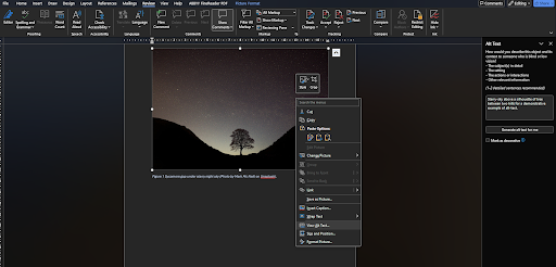
So how do you actually add alt-text? In Microsoft Word, you can simply right-click an image and select the ‘View Alt Text …’ option. This will open a side panel, seen in Figure 3, allowing you to add alt text. Microsoft Word even offers an auto-generation feature for creating alt-text! But it is always best to check auto-generated content, and change it where appropriate.
If you would like to read more about alt text, WCAG also provides a handy guide to alt text.
Colour Use
An estimated 4.5% of the UKs population are colourblind. As archaeologists, we produce a large quantity of maps, CAD drawings, and graphical plots. Have you ever considered how the use of colour in content can impact accessibility? The colours we choose, if we’re not careful, can render site plans and other CAD drawings, graphs and even reports and documents that are difficult to use or read for many individuals.
Colourblindness is complicated: there are different types of colourblindness that affect different colours. If you’re interested in learning more about the different types of colourblindness, Colour Blind Awareness has a handy guide to the types of colour blindness.
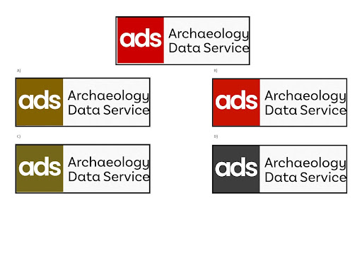
The variety of colours affected can make content design difficult. Handily, tools exist to help inform on design decisions when it comes to colour-blindedness. Coblis; a colourblind simulator, allows you to upload an image, and simulate the different versions of colourblindness. Here we’ve used Coblis to see how the ADS logo is seen by users with different types of colour-blindness (Figure 4). If you’re struggling to come up with a colourblind friendly palette, try the Coolors Palette Tool to help find a suitable group of colours.
Figure 4: Simulated Colourblindness impact on ADS logo (A: Protanopia; B: Tritanopia; C: Deuteranopia; D: Monochromacy) using Coblis.
Further to this, if creating graph plots, consider utilising shape and colour in unison to differentiate data groups. Likewise, with CAD drawings, consider combining colour and patternation to differentiate layers. If possible, we should avoid using only colour to denote differences or highlight content.
If you are interested in using colourblind friendly palettes, and their application to archaeological data, keep an eye out for the CHRoMA project (Cultural Heritage Review on Map Accessibility) by Historic Environment Scotland.
Reviewing Documents: Accessibility Checkers
So, you’ve created a document, selected a suitable accessible font, created meaningful hyperlinks, added alt text to images, and formatted and structured your text through the styles function. What next? Are you sure you haven’t missed alt text for a critical image? Is all the text structured through styles? Not sure? Fear not. Some word processors offer a tool to check your documents for accessibility issues.
For example, within Microsoft Word, the Review tab offers an accessibility reviewing tool. While not perfect, this tool will quickly scan your document, and identify accessibility issues and suggest improvements you can make. It is always a good idea to check your document with this tool before you publish the digital content.
In this blog, we’ve explored how font choice, meaningful hyperlinks, alt text, and colourblind friendly palettes can improve the accessibility of your documents. Equipped with the new information, what steps will you take to make the digital content you produce more accessible?